1. Library Contents
As long as liteBox.pro popup uses a few JavaScript dependencies you get several different versions of the library file. After you download the archive you will find these files inside:
- liteboxpro.js [ 85 kB ]
- liteboxpro.min.js [ 36 kB ]
- liteboxpro_gsap.min.js [ 91 kB ]
You will benefit the most if you're already using GSAP 3 animation library in your projects. Because then you can use only one lightweight 36 kB core file.
- liteboxpro.js
- — it is a core library file. The uncompressed development version.
- liteboxpro.min.js
- — it's a minified version of the core library file.
- liteboxpro_gsap.min.js
- — it's a minified library file with GSAP library included.
This file is convenient to use if you don't use GSAP on your website and you want to have just a one-click lightbox solution.
2. Prepare HTML for liteBox.pro
- Download and unzip the archive.
- Copy the liteboxpro_gsap.min.js file into the "js" folder next to your HTML file.
If you already use GSAP 3 in your current project, then use liteboxpro.min.js instead. - Add <script> tag before the </body> tag, like this:
<script src="js/liteboxpro_gsap.min.js"></script> - Mark page elements with data-lbxp and/or data-lbxp-img attributes. Example:
<img src="/images/01.jpg" data-lbxp>
<img src="/images/02.jpg" data-lbxp-img="/images/02_big.jpg">
After you mark all necessary elements, the liteBox.pro will automatically make them open as popup windows on click. If you've already placed the attributes you can move to the next chapter: Initiate lightbox in JavaScript
Notice About Z-Index
In HTML liteBox.pro element is located at 100 z-index level. If you have elements that have higher z-index, then they will be visible on top of the popup's background. You can change z-index property when initiate the LiteBoxPro gallery.
How to Use data-lbxp Attribute
You can use data-lbxp only inside <a> and <img> tags:
<a href="/images/01_big.jpg" data-lbxp-img="/images/01_big.jpg">...</a>
<img src="/images/02.jpg" data-lbxp-img="/images/02_big.jpg">
liteBox.pro will automatically find a link to your image or video and show it as lightbox window on click. You should remember that when liteBox.pro is bound to an <a> tag) this will block the standard link's functionality and won't redirect your website user to another page. If you want your user to navigate to the page with video or image, then don't assign data-lbxp or data-lbxp-img attributes to that link.
How to Use data-lbxp-img Attribute
You can use data-lbxp-img="" attribute with almost any element (tag) on the page, like this:
<img src="/images/01.jpg" data-lbxp-img="/images/01_big.jpg">
<a href="/images/02.jpg" data-lbxp-img="/images/02_big.jpg">...</a>
<h2 data-lbxp-img="/images/03.jpg">...</h2>
<span data-lbxp-img="/images/04.jpg">...</span>
<button data-lbxp-img="/images/05.jpg">...</button>
<div data-lbxp-img="/images/06.jpg">...</div>
...
...
...
Here inside the quotes, you specify a URL to your image, which will be opened in the popup window. And liteBox.pro will load that image no matter what URL you have in the src="" or href="" attribute (if they're available).
This is especially useful attribute if you want to load a small thumbnail image on the page, but load a big full-size image aftef the click. You will want to use this attribute in the majority of your image galleries.
data-lbxp-img cannot be used for video links.
How to Show Video in a Lightbox Window
Just add a data-lbxp attribute to the link with your video, like this:
<a href="https://youtu.be/gI3hddkDl_Q" data-lbxp>...</a>Live example:
liteBox.pro will automatically find the link to your video and embed it into the lightbox window. And after that, when your website visitor clicks video link, he won't be redirected to the video service. Instead, the video will open in the popup.
If you use element without href attribute or you want to use an alternative link for the video opened in the popup, then use data-lbxp-video="" attribute.
Video Hosting Services
At this moment liteBox.pro supports the next video hosting sites:
- Youtube
- Vimeo
You can use different link formats (where XXXXXXXXX it's a video ID):
- https://vimeo.com/XXXXXXXXX
- https://www.youtube.com/watch?v=XXXXXXXXX
- https://youtu.be/XXXXXXXXX
- https://youtu.be/XXXXXXXXX?param=1¶mB=2
- https://www.youtube-nocookie.com/embed/XXXXXXXXX
- and many other…
They all will be valid!
For example:
<a href="https://youtu.be/gI3hddkDl_Q" data-lbxp>...</a>
<a href="https://youtu.be/gI3hddkDl_Q" data-lbxp-video>...</a>
<div data-lbxp-video="https://youtu.be/gI3hddkDl_Q">...</div>
Locally Hosted Videos
When you deal with the local video files on your server or in your computer's file system, you use the same attributes as for the video hosting sites:
- data-lbxp
- data-lbxp-video
- data-lbxp-video=""
liteBox.pro will automatically detect the difference between remotely and locally hosted videos!
<a href="my-video.mp4" data-lbxp>...</a>
<a href="my-video.mp4" data-lbxp-video>...</a>
<div data-lbxp-video="my-video.mp4">...</div>
Very often, you may want to add video in different formats to find the best compromise between browsers and compression rates. liteBox.pro allows you to do that with the help of data-lbxp-video="" attribute:
<div data-lbxp-video="my-video.ogv | my-video.webm | my-video.mp4">...</div>In the above example in the data-lbxp-video attribute you specify URLs to different video formats separated by the vertical bar symbol |. In this case, space symbols don't matter. But the URLs' order matters in the same way as the order of <source> elements matters inside the <video> tag.
The list of most common video formats swhich you can use with liteBox.pro:
- ogv
- ogm
- ogg
- webm
- mpeg
- mp4
You can use additional video settings, such as autoplay, muted, controls, poster etc.
How to Show Custom HTML in a Popup Window
To add any custom HTML markup into your popup window use attributes data-lbxp or data-lbxp-html. Couple of examples with both attributes:
<div data-lbxp-html="my-markup.html">...</div>
<a href="my-markup.html" data-lbxp>...</a>
At the same time, in your HTML markup you don't need to use such elements as <html>, <head> or <body> — just a bare HTML markup. But if you want, you can add <style> element to it. For example:
<style>
	input.in-popup {
		border: thin solid red;
	}
</style>


<form action="#" method="post">
	<label>E-mail
		<input class="in-popup" type="email" name="email" value="">
	</label>
	<button type="submit" name="submit">Send</button>
</form>
You still can use a full HTML document with <head> and other tags, but they'll be ignored by the browser. If you want to use a complete (external) webpage inside of your lightbox window, then it's better to use iframe option.
Don't afraid to experiment and, please, send us feedback if you stumble upon any issues.
The list of web page formats which will be recognized by liteBox.pro as an HTML markup:
- asp
- aspx
- htm
- html
- htmls
- jsp
- php
- xhtml
How to Show IFrame in a Popup Window
To embed iframe element into your popup window use data-lbxp-iframe="" attribute. Where in the quotes you specify URL to a web page which you want to show in the popup. The URL can be both absolute (for example: "https://mysite.com/form" ) or relative (like "/form").
You can use attribute without quotes if you add it to an <a> tag. Both examples are shown below:
<div data-lbxp-iframe="https://litebox.pro/examples">...</div>
<a href="https://litebox.pro/examples" data-lbxp-iframe>...</a>
3. Initiate lightbox in JavaScript
After you linked one of library files to your HTML page and marked elements with lbxp attributes, you're ready to initiate the popup. And everything you need to do is to add bit of code into your scripts:
new LiteBoxPro();All done! You can check your page now.
The liteBox.pro script will find all the elements marked with "lbxp" attributes and make them open in lightbox windows. By default it will look through the entire HTML page, find all the marked elements and show them as one gallery sequence. No matter where those elements are located on the page and how many of them there are.
If you don't want the liteBox.pro script to look through the entire HTML page, but want to limit its "search area", then you can specify a CSS selector for the element, which contains your gallery items. For example, like this:
new LiteBoxPro('#my-gallery');Any CSS selector will be valid here. And the hierarchy of child elements inside the "container" doesn't matter.
Alternatively, you can specify a JS object instead of the CSS selector:
new LiteBoxPro(galleryElement);There are a few other ways of how you can declare your lightbox gallery: Usage Examples.
And if you want to know more about the available gallery settings, welcome here: Custom Settings
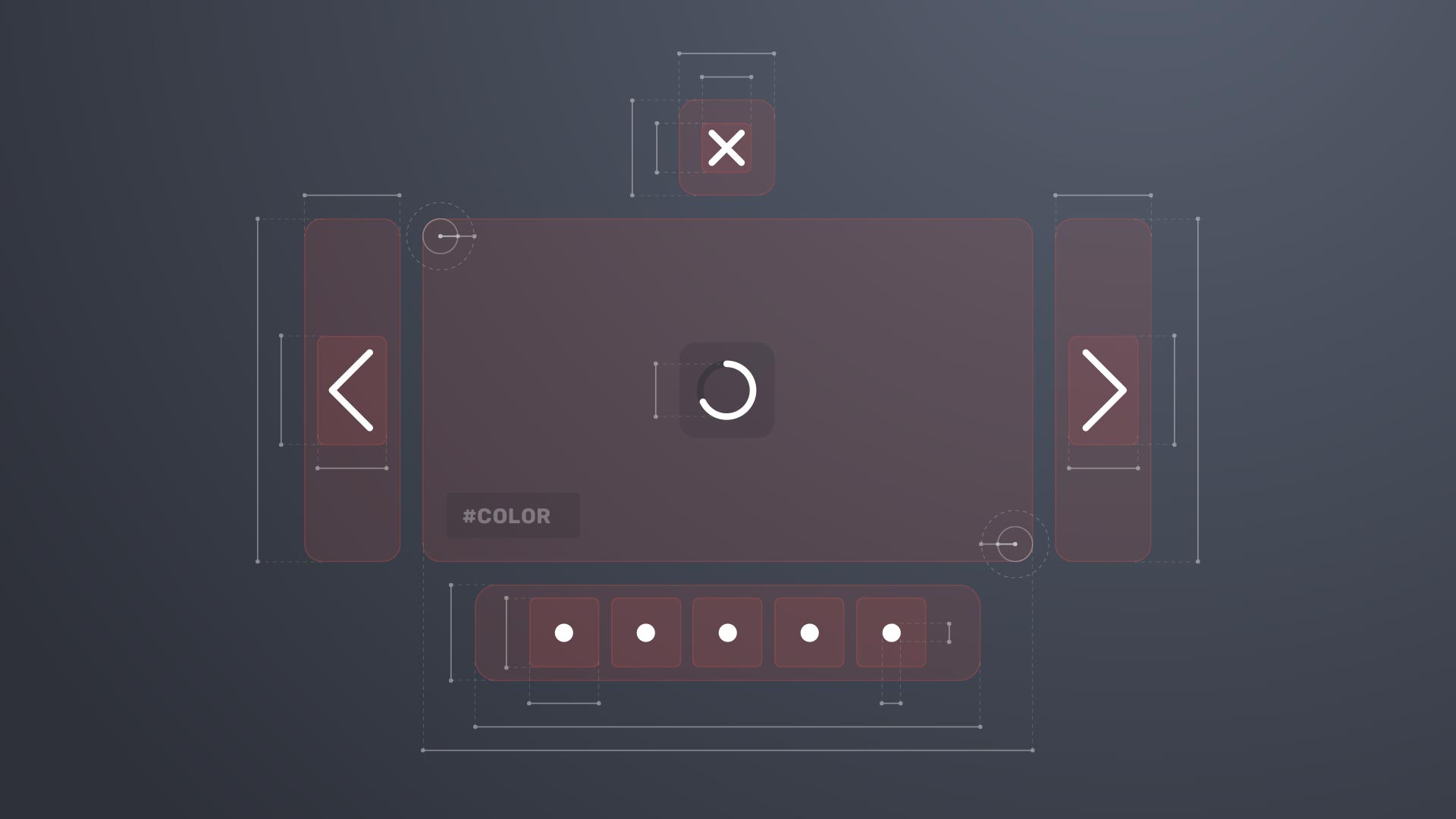
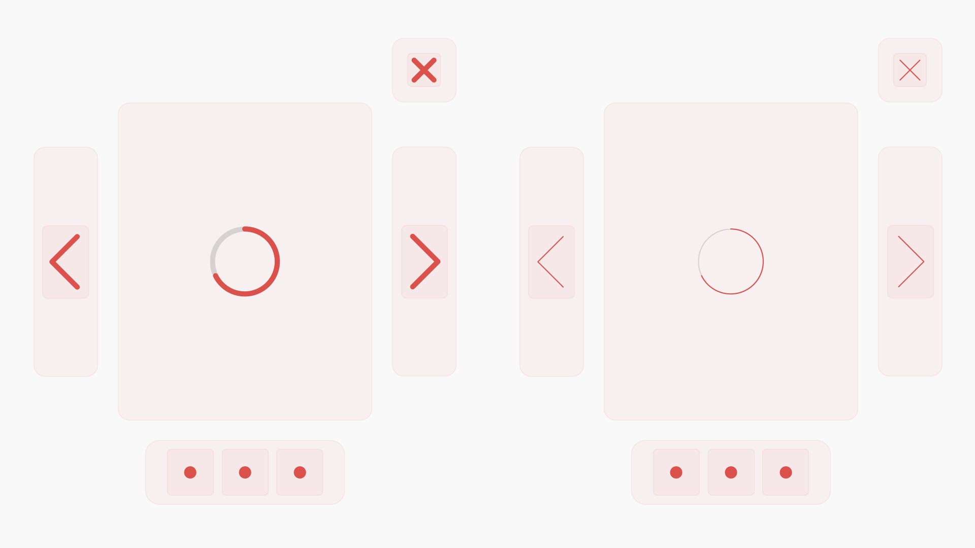
4. Interface Elements
Right now liteBox.pro popup window has the following UI components:
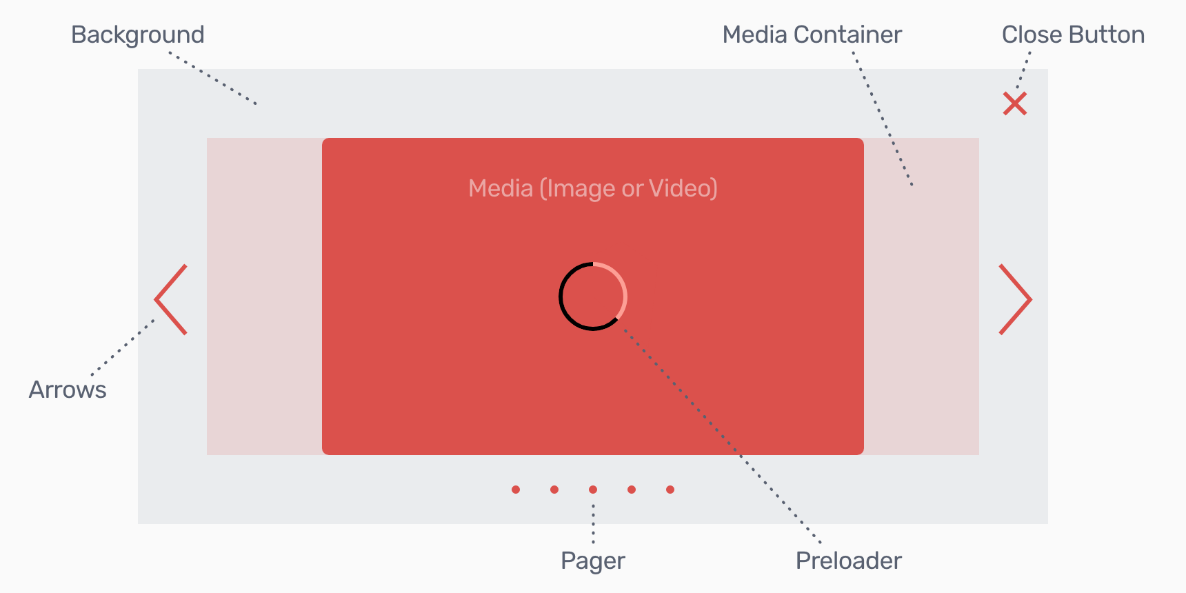
Background
Background — it's an element which is placed behind all the other UI components. Its main and the only one purpose is to isolate lightbox window from the rest of the website interface. That allows to attract user's attention to such elements as close button, navigation arrows and pager. Otherwise, if web page content is quite busy, it may be difficult for user to spot those control elements.
In the gallery settings you can change background's color and opacity.
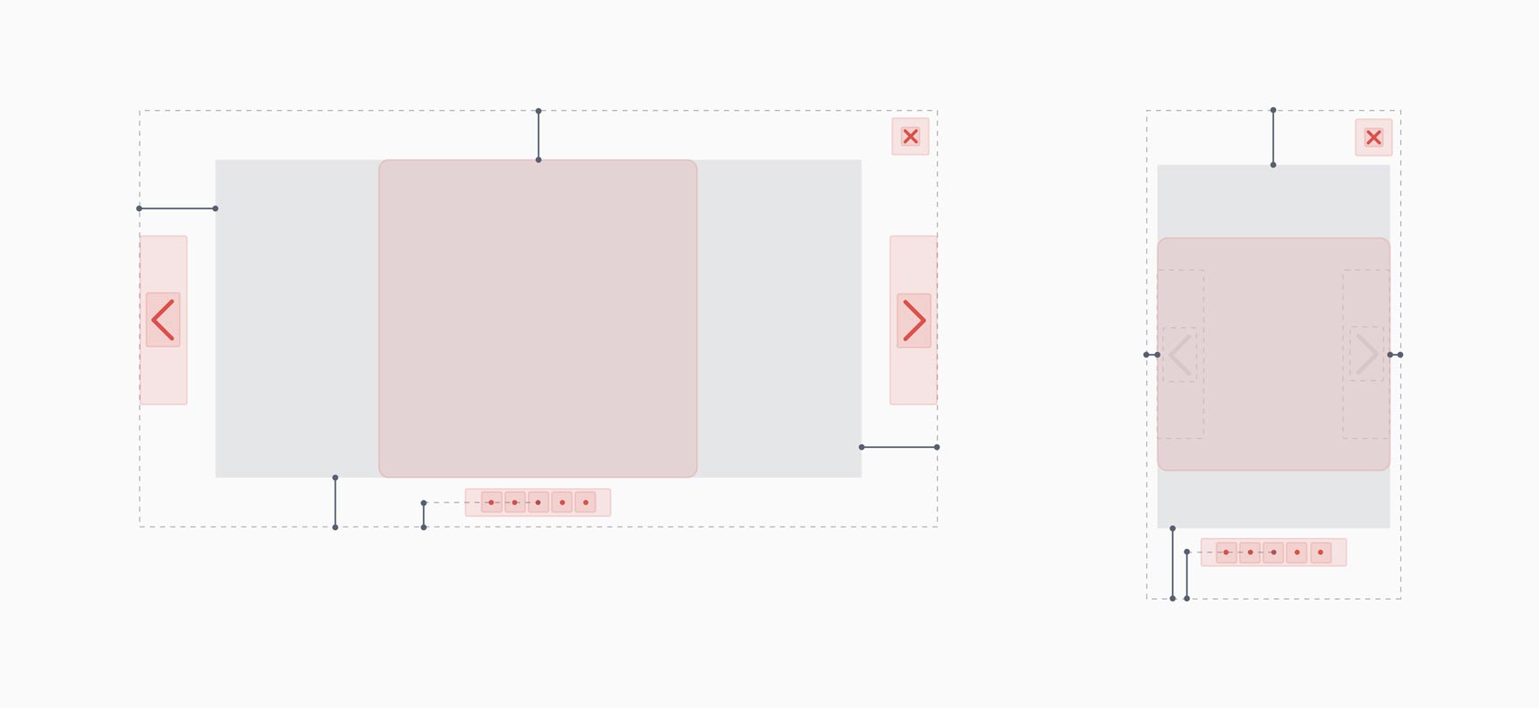
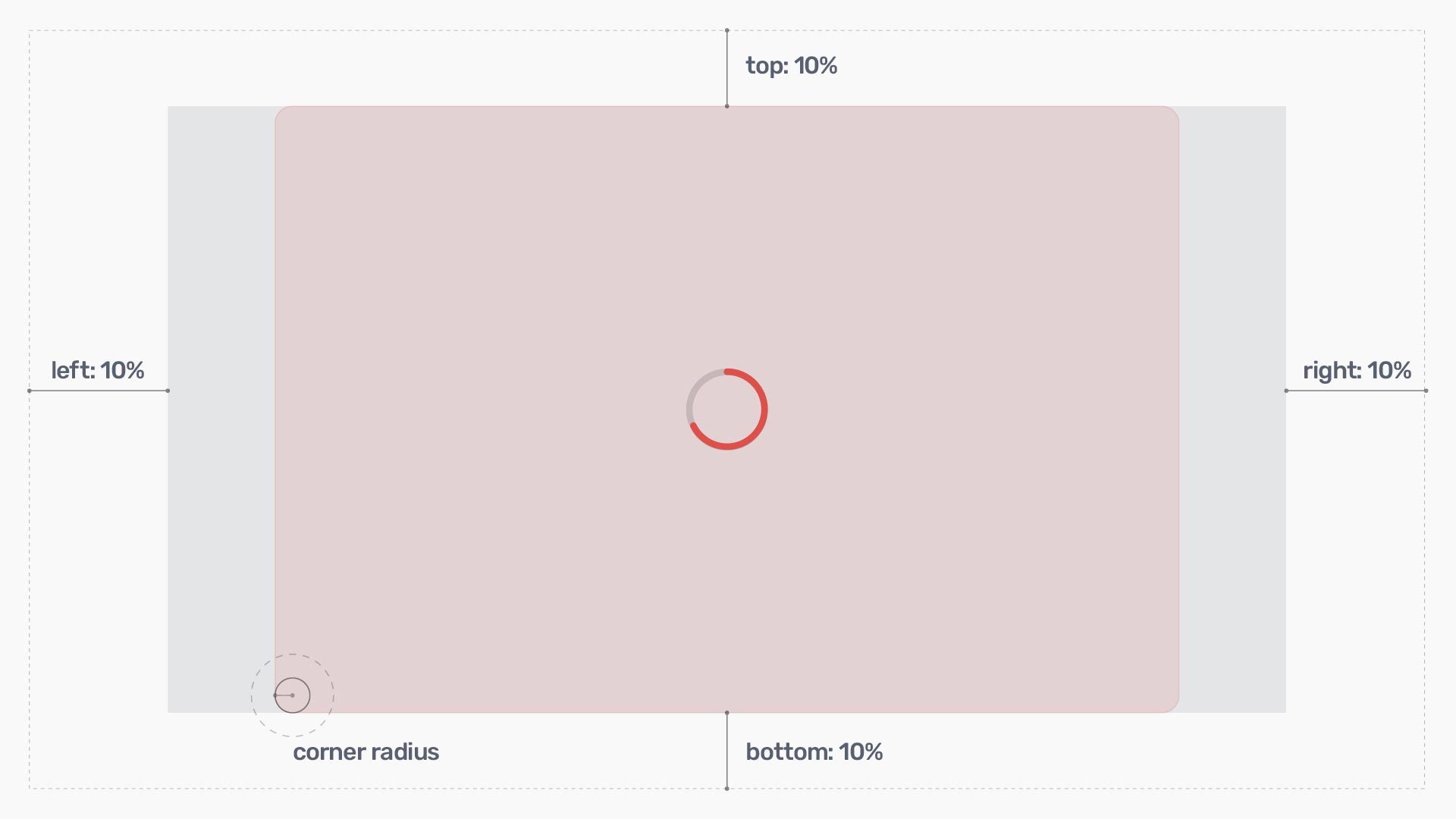
Media Container
At a first glance it may seem not intuitive, but media container it is not that visible image or video which you see in the lightbox. The media contaner it's an element that contains image or video player inside.
To make it clear, let's imagine that we have 10% container margins from all sides. Take a look at the illustrations below:
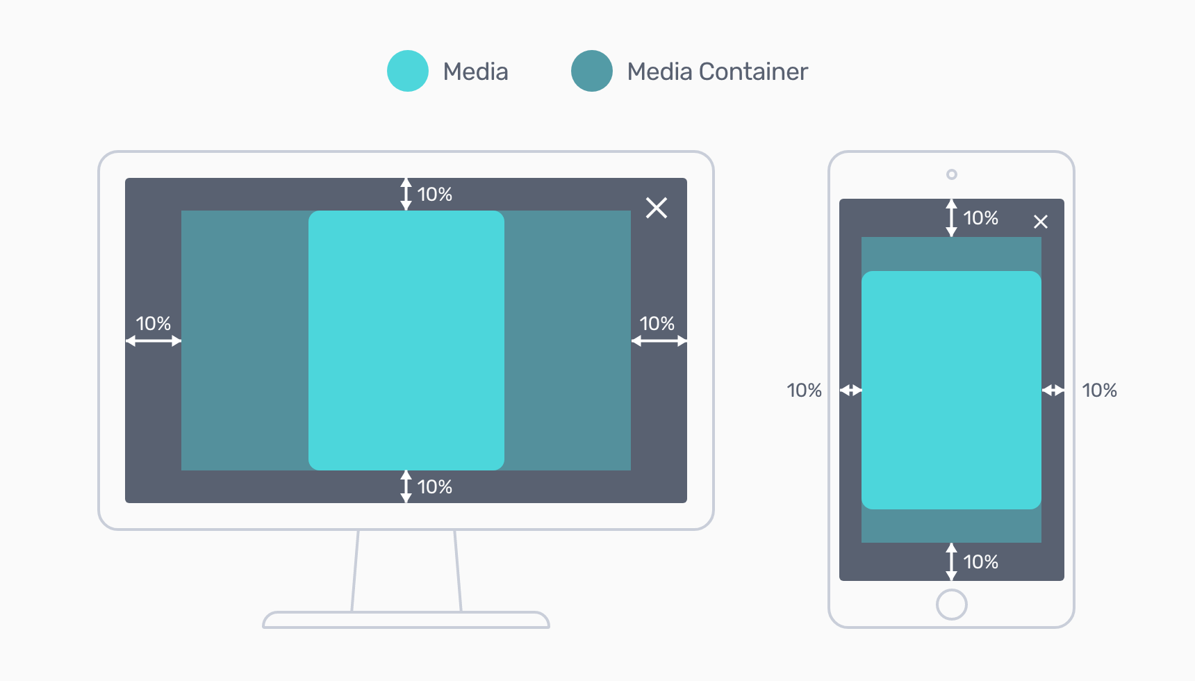
As you can see on the image above, the container is bigger than the media itself. And when container is resized, the media allways resizes to fit the container's size. In other words, the media inside the container behaves the same as background-size: contain property in CSS.
Here is another example, but with wide horizontal media:
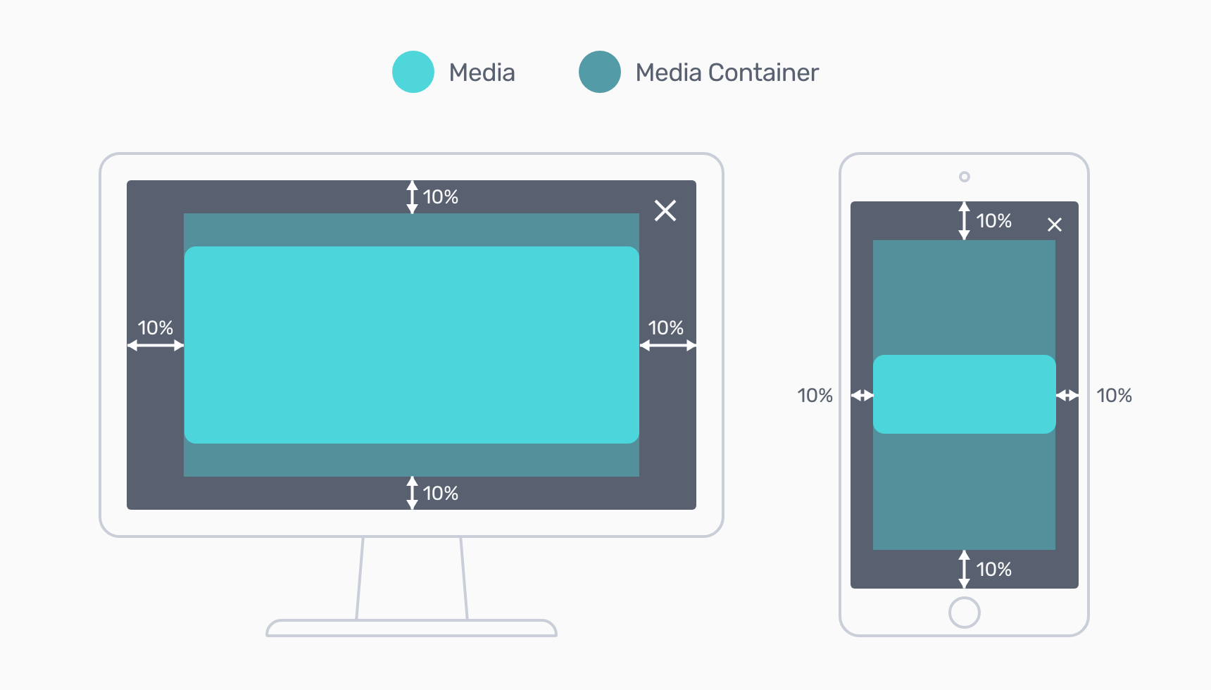
And a final animated example illustrating the same logic:
Also, when you drag/swipe media on touch screens you, actually, drag the media container. This appears to be more user friendly, because the media container is usually bigger than the image it contains. As a result: more space to place a finger.
You can change margins around media container in popup settings in JavaScript.
Close Button
It's obvious that the close button serves to close the opened lightbox. But you should know that this button appears on top of all the other UI elements of the liteBox.pro popup. For example, if close button is big enough, it may cover other elements and they will be blocked for click. It's important to remember when you design your popup for small screens.
Arrows
The arrows functionality is pretty straightforward. They're used for navigation through the gallery.

There are two states for the arrows: enabled and disabled. The arrows get disabled when you reach the end of the gallery sequence. Or when you're at the beginning of it. When the arrows disabled, they are faded. By default, the disabled arrow has 0.2 opacity.
You can easily change that preference in the liteBox.pro gallery settings.
Pager
Pager shows the progress during the navigation through the gallery sequence. The currently opened media is marked with an opaque dot. The rest of the gallery items are marked with semitransparent circles.

If you have only one item in the gallery, then pager is hidden.
Pager Compact Look
Sometimes you may have too many items in the gallery. And showing them all as small circles will be neither user-friendly nor aesthetically attractive. And the liteBox.pro has an ingenious and simple way out: when the number of items cannot fit page width, the pager changes to a graceful scroller. The animation below shows how it looks in practice:
There are plenty of pager parameters that can be changed throught the gallery settings: starting with the circles' opacity and finishing with pager's max-width breakpoint.
Image Preloader
Preloader shows the progress of the loaded media. Unlike many other image preloaders which you can see in other JS lightbox libraries, the liteBox.pro's preloader shows real progress with the circular line indicating the percentage of loaded data:
The preloader will work with all images and embedded HTML contents. But it won't show if you load videos or web pages via iframe because liteBox.pro uses XMLHttpRequest object to load the file contents. And this object is not used while loading videos or iframes.
You can set a desired size (the diameter) of the preloader when you initiate the LiteBoxPro gallery object in JavaScript.
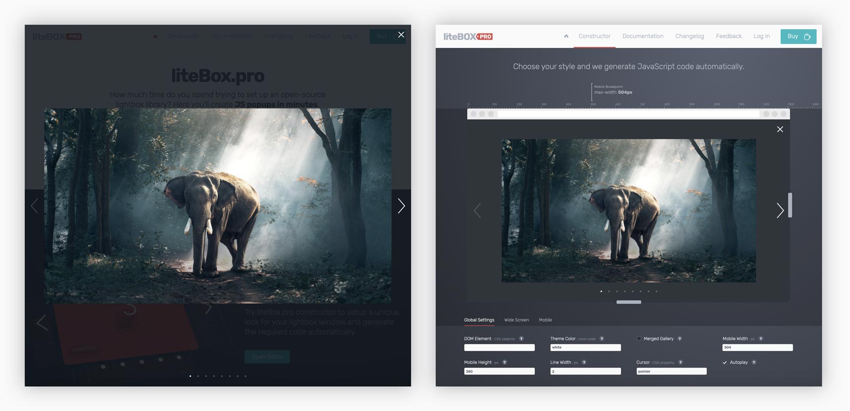
5. Custom Settings
Don't bother. Just use liteBox.pro constructor, which will generate all the settings automatically.
You can adjust more than 50 custom parameters of your gallery to make it look unique and adapt better for a specific project needs. On top of that, when you initiate several galleries on one page, you can set a unique style for each gallery. Check this example.
If you want to change some default settings, you should include javascript object {…} with parameters when you initialize LiteBoxPro() gallery. For example:
new LiteBoxPro({
	theme_color: '#FF3399'
});
You can find the complete list of all default settings in the end of this documentation.
A Note About Settings StructureA quick way to initialize gallery for a specific element can be done by simply passing a CSS selector to the gallery settings:
new LiteBoxPro('.my-gallery');This is not a standard way to do this, but it is made intentionally for interface simplification. And if you want to add some other settings you should write it like this:
new LiteBoxPro({
	dom_element: '.my-gallery',
	theme_color: '#FF3399'
});
Global Settings
Target Object
You can specify a parent object for you popup window. In other words, you choose what part of the page your popup window will cover. For example: when user opens a popup window, its background may cover the entire page, of just a part of it. You choose.
By default the target object is <body>.
How to Chage Target Object for the Lightbox
new LiteBoxPro({
	target: '.my-section'
});
z-Index
You can change z-index of the popup window. The default value is 100.
new LiteBoxPro({
	z_index: 99
});
DOM Element
DOM element is an element on the page (the parent object) inside which liteBox.pro will look for gallery items. For example, you may want to have several independent image galleries within one page. In this case, you will initialize each of those galleries by defining their parent objects.
new LiteBoxPro({
	dom_element: '#my-gallery'
});
The same as this:
new LiteBoxPro('#my-gallery');Theme Color
When you change color of the lightbox gallery you change it for all the elements simultaneously.
Put any CSS value. For example, all these are valid:
- deepskyblue
- #54bdf9
- rgb(84, 189, 249)
- hsla(201, 93%, 65%, 1.0)
new LiteBoxPro({
	theme_color: 'deepskyblue'
});
Merged Gallery
If within one page you have several galleries marked by the same class name , then you can choose whether they all will be shown as one big gallery or as separate sequences. Check demo examples here:
new LiteBoxPro({
dom_element: '.gallery',
merged_gallery: true // or false
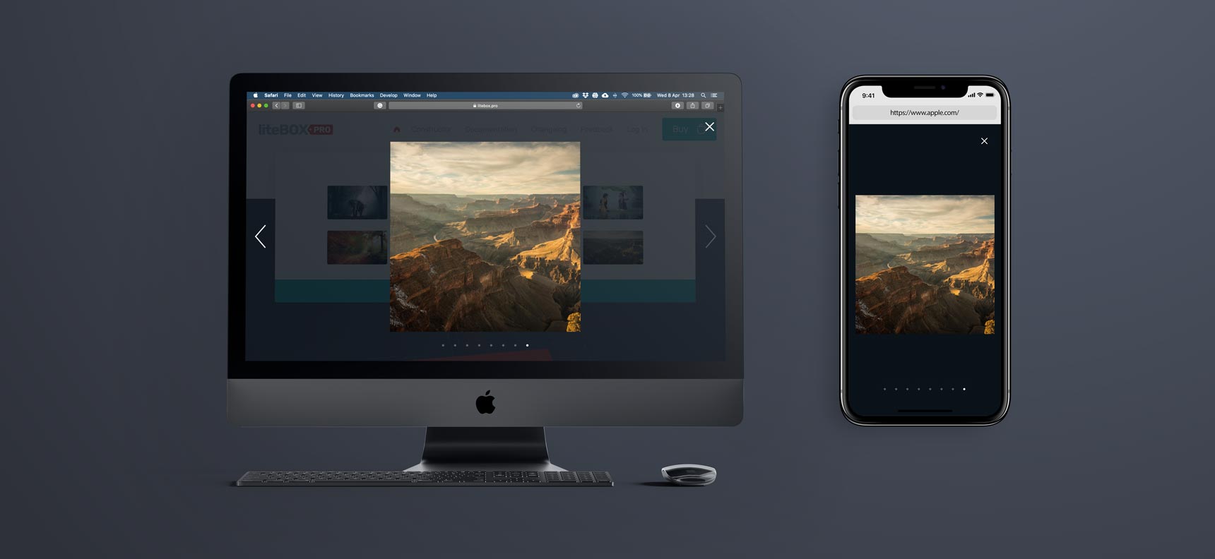
});Mobile Width & Height
liteBox.pro's unique feature is that you can change the look of your popup window depending on the size of the screen. It's very useful when you're dealing with responsive design and want to adapt web page for small mobile screens.
You have a choice between two states:
- default look
- mobile look
And you can control at what page width and height the switch between these two states will take place:
new LiteBoxPro({
	mobile_width: 504
	mobile_height: 380
});
Cursor
You can choose how the mouse cursor will look when you roll mouse over an item in the gallery. The default value is 'pointer'. Any CSS value is valid.
new LiteBoxPro({
	cursor: 'pointer'
});
Line Width
When you change line width it changes the look of such UI elements as: close button, arrow buttons and preloader.
new LiteBoxPro({
	line_width: 3
});
Page Scroll
By default, when you open the liteBox.pro's popup window it automatically block all scroll event of the device. This is made intentionally for asability improvement when the popup covers the entire page. But if you embed popup window into a smaller element on the page you may want to keep scrolling events. The example of such behaviour you may see at the constructor page.
To keep page scroll after the popup is opened set property value to true:
new LiteBoxPro({
	page_scroll: true
});
Keyboard Shortcuts
For better user experience liteBox.pro allows user to use some keyboard shortcuts for gallery navigation.
- Esc
- Close lightbox window
- Left Arrow
- Switch to the previous item in the gallery
- Right Arrow
- Switch to the next item in the gallery
If you want to disable this feature, then set false for the 'keyboard' property:
new LiteBoxPro({
	keyboard: false
});
Video
If you have locally hosted videos in your gallery then you can add any amount of HTML attributes supported by the <video> tag.
By default, only one attribute is enabled in liteBox.pro, which is autoplay.
To add other attributes set them inside the video: {…} object. For example:
new LiteBoxPro({
	video: {
		autoplay: false,
		controls: true,
		muted: true,
		poster: 'images/my-video-poster.jpg'
	}
});
Position Interface Elements
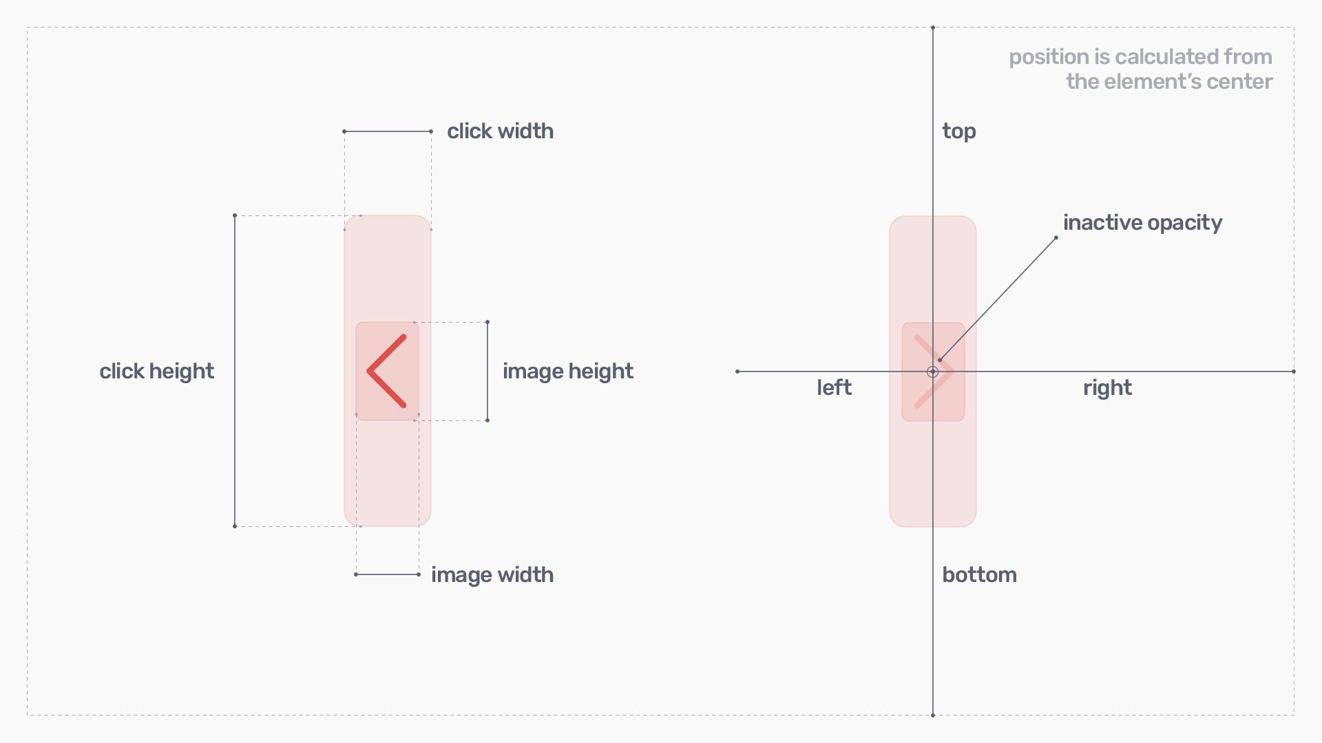
You can set a unique positioning for almost each component of the lightbox window: arrows, pager, close button… Place them wherever you like. But unlike CSS, where you calculate margins from the edge of an element, here all distnces are calculated from the element's center.
There is no need to set all 4 properties: top, left, right, bottom. Because if you set both top and bottom, the bottom will be ignored. If you set both left and right — the right will be ignored.
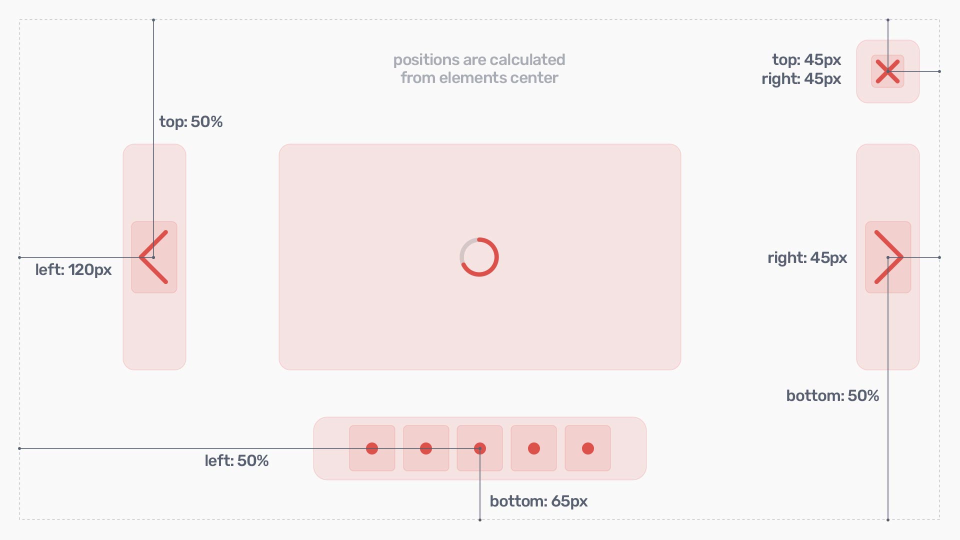
Such lightbox components as arrows, pager and close button can be positioned anywhere on the page. The approach is similar for all the elements.
Media & Container Settings
You cannot set position for media container, instead you change its margins. Keep in mind, that margins are set for the container, but not for the media element (image). The media element will automatically adjust to fit the container's size.
Additionally, you can change media element's corner roundings.
Background Settings
Background element has 3 simple properties to change:
- opacity
- color
- show/hide
Pager Settings
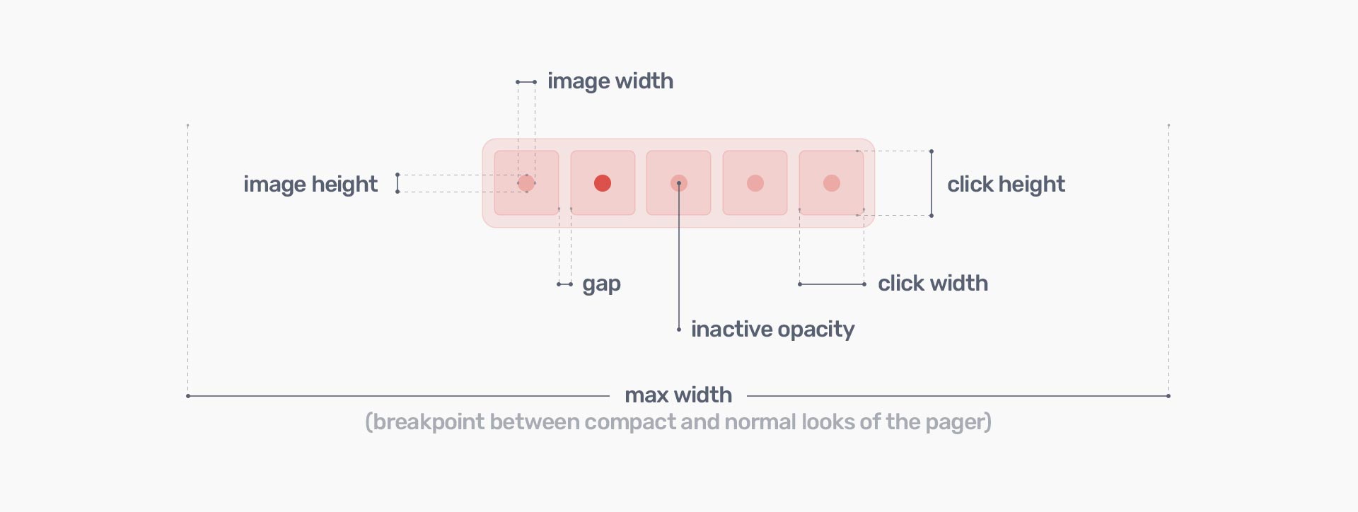
Pager has the next list of properties:
- show/hide
- image width/height
- click width/height
- gap
- inactive opacity
- max width
- position:
- top
- right
- bottom
- left
Example, in which we change some default settings:
new LiteBoxPro({
	pager: {
		default: {
			gap: 5,
			inactive_opacity: 0.2,
			position: {
				bottom: '60px'
			}
		},
		mobile: {
			hide: true
		}
	}
});
A Few Notes
Arrow Settings
Arrows have the next list of properties:
- show/hide
- image width/height
- click width/height
- inactive opacity
- position for the left & right arrows separately:
- top
- right
- bottom
- left
Example, in which we change some default settings:
new LiteBoxPro({
	arrows: {
		default: {
			click_height: '200px',
			inactive_opacity: 0
		},
		mobile: {
			hide: false,
			click_width: '44px',
			click_height: '100%',
			position_left: {
				left: '22px'
			},
			position_right: {
				right: '22px'
			}
		}
	}
});
Close Button Settings
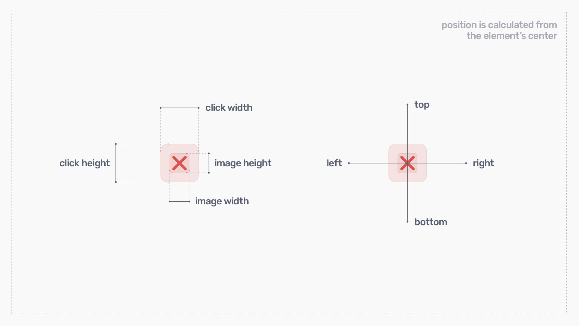
Close button has the next list of properties:
- show/hide
- image width/height
- click width/height
- position:
- top
- right
- bottom
- left
Example, in which we change some default settings:
new LiteBoxPro({
	close_btn: {
		default: {
			position: {
				top: 24,
				right: 24
			}
		},
		mobile: {
			hide: false,
			click_width: 44,
			click_height: 44
			position: {
				top: 22,
				right: 22
			}
		}
	}
});
Preloader Settings
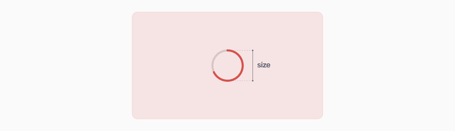
How to change the preloader size:
new LiteBoxPro({
	preloader: {
		default: {
			size: '64px'
		},
		mobile: {
			size: '64px'
		}
	}
});
All Default Settings
Here is the liteBox.pro settings object with all default properties:
new LiteBoxPro({
	target: document.body,
	z_index: 100,
	dom_element: null,
	theme_color: '#FFF',
	merged_gallery: false,
	mobile_width: '504px',
	mobile_height: '380px',
	cursor: 'pointer',
	line_width: 3,
	page_scroll: false,
	keyboard: true,
	video: {
		autoplay: true
	},
	media: {
		default: {
			corner_radius: '3px',
			margin: {
				top: '80px',
				bottom: '80px',
				left: '80px',
				right: '80px',
			}
		},
		mobile: {
			corner_radius: '3px',
			margin: {
				top: '50px',
				bottom: '50px',
				left: '20px',
				right: '20px',
			}
		}
	},
	background: {
		default: {
			hide: false,
			opacity: 0.85,
			color: '#0B121A'
		},
		mobile: {
			hide: false,
			opacity: 1,
			color: '#0B121A'
		}
	},
	pager: {
		default: {
			hide: false,
			img_width: '6px',
			img_height: '6px',
			click_width: '32px',
			click_height: '32px',
			gap: 0,
			inactive_opacity: 0.3,
			max_width: '70%',
			position: {
				top: 'auto',
				right: 'auto',
				bottom: '40px',
				left: '50%'
			}
		},
		mobile: {
			hide: false,
			img_width: '6px',
			img_height: '6px',
			click_width: '32px',
			click_height: '32px',
			gap: 0,
			inactive_opacity: 0.3,
			max_width: '80%',
			position: {
				top: 'auto',
				right: 'auto',
				bottom: '26px',
				left: '50%'
			}
		}
	},
	arrows: {
		default: {
			hide: false,
			img_width: '50px',
			img_height: '80px',
			click_width: '80px',
			click_height: '100%',
			inactive_opacity: 0.2,
			position_left: {
				top: '50%',
				right: 'auto',
				bottom: 'auto',
				left: '40px'
			},
			position_right: {
				top: '50%',
				right: '40px',
				bottom: 'auto',
				left: 'auto'
			}
		},
		mobile: {
			hide: true,
			img_width: '33px',
			img_height: '53px',
			click_width: '40px',
			click_height: '100%',
			inactive_opacity: 0.2,
			position_left: {
				top: '50%',
				right: 'auto',
				bottom: 'auto',
				left: '20px'
			},
			position_right: {
				top: '50%',
				right: '20px',
				bottom: 'auto',
				left: 'auto'
			}
		}
	},
	close_btn: {
		default: {
			hide: false,
			img_width: '24px',
			img_height: '24px',
			click_width: '48px',
			click_height: '48px',
			position: {
				top: '40px',
				right: '40px',
				bottom: 'auto',
				left: 'auto'
			}
		},
		mobile: {
			hide: false,
			img_width: '18px',
			img_height: '18px',
			click_width: '40px',
			click_height: '40px',
			position: {
				top: '30px',
				right: '30px',
				bottom: 'auto',
				left: 'auto'
			}
		}
	},
	preloader: {
		default: {
			size: '64px'
		},
		mobile: {
			size: '64px'
		}
	}
});
Default & Mobile Options
You may've been noticed that all lightbox components (except global settings) duplicate their properties in the default: {…} and mobile: {…} objects.
Thanks to this you can change the look of your popup window across different screen sizes. For example, if user opens popup on a big desktop screen the popup styles are taken from the default properties. If screen (page) size is small the popup will take settings from the mobile properties. Hence, you can make your popup look completely different on the mobile & desktop screens, if needed.
For more examples check the "Mobile Width & Height" chapter.